
Last Updated on May 1, 2025 by Eric Feldberg
I created this Angular date picker to have as a standalone component. A feature to easily add into projects as needed. I arrived at this decision after taking unnecessary time to configure everything that Material needs.
I’ve done this several times. Much of what the UI libraries supply can be developed as custom features. Custom features vs needing to conform to a library or framework. In this case, Material or Bootstrap’s date picker component. In turn, I created this Angular date picker.
Moreover, we could use the native date picker without a libraries overhead. The caveat however is customization. Which is often the challenge with any type of existing web component. Bootstrap components, WordPress plugins, or native elements such as radio buttons, etc.
Having full control over styling, positioning, and functionality is undoubtedly my preference. Note, though this is written in Angular, it’s really only the markup that has a small amount of framework specific features. Otherwise, it’s largely TypeScript.
Another custom component example is the Angular accordion. Largely TypeScript, with a few Angular helpers. As is the case with the Angular Slider. Both are mainly JavaScript and TypeScript.
This D3 Bar Chart on the other hand is far more complex JavaScript. No way would I want to build a chart without a library!
The TypeScript file has a number of moving parts. Once we get past the first function however, it’s not that complex.
Table of Contents
How it Works
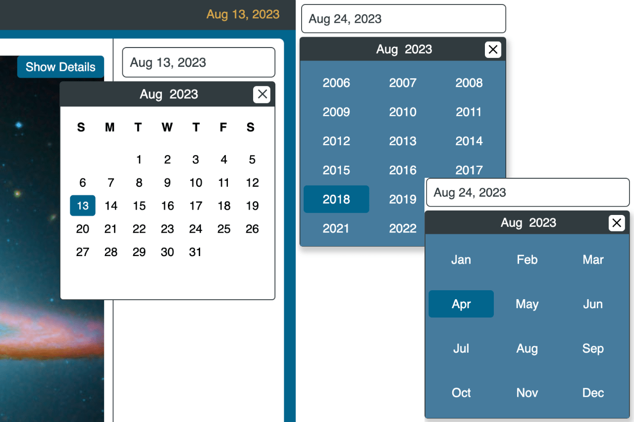
- calendarVisible is the variable that determines if the component is open or closed. Whether it’s in the DOM, or removed.
- d is the date object.
- Manually declare weekdays, months, and years.
- currentDay, monthIndex, and year are standard date methods.
- firstDay and lastDay holds the first and last day of each month respectively.
- monthsMenu determines visibility of the months when the current month is clicked.
- yearsMenu the same as monthsMenu.
@Component({
  selector: '[app-calendar]',
  templateUrl: './date-picker.component.html',
  styleUrls: ['./date-picker.component.scss'],
})
export class DatepickerComponent implements OnInit {
  calendarVisible: boolean = false;
  d: any = new Date();
  weekdays: readonly string[] = ['S', 'M', 'T', 'W', 'T', 'F', 'S'];
  months: readonly string[] = ['Jan','Feb','Mar','Apr','May','Jun','Jul','Aug','Sep','Oct','Nov','Dec'];
  years: readonly number[] = [2003, 2004, 2005, 2006, 2007, 2008, 2009, 2010, 2011, 2012, 2013, 2014,
                  2015, 2016, 2017, 2018, 2019, 2020, 2021, 2022, 2023];

  currentDay: any = this.d.getDate();
  monthIndex: any = this.d.getMonth();
  year: any = this.d.getFullYear();
  firstDay: any;
  lastDay: any;
  monthsMenu: boolean = false;
  yearsMenu: boolean = false;
  daySpan: any[] = [];
  selectedDate: number;
  currentDate: number;
}- In the calculateStartEndDate fn, we loop over 42 indices. With seven days in a week multiplied by six potential weeks in a month, there’s 42 possible days. One month may begin on a Saturday, end on Sunday—spanning six weeks. If the first day of the month is greater than one of the 42, add empty cells. Then push those values to the array.
  calculateStartEndDate(firstDayOfMonth: number, lastDayOfMonth: number) {
    this.daySpan = [];
    let dayIndex = 1,
      emptyCells = 0;
    // 7 * 6 = 42 (MAX NUMBER OF CELLS)
    for (let i = 0; i < 42; i++) {
      if (firstDayOfMonth > i) emptyCells++;
      this.daySpan.push({
        value:
          i >= firstDayOfMonth && i < emptyCells + lastDayOfMonth
            ? dayIndex++
            : null,
      });
    }
}- The firstLastDays fn gets the first and last day of the month respectively, then passes them into the previous fn.
  firstLastDays() {
    this.firstDay = new Date(this.year, this.monthIndex, 1);
    this.lastDay = new Date(this.year, this.monthIndex + 1, 0);
    this.calculateStartEndDate(this.firstDay.getDay(), this.lastDay.getDate());
}- selectDay(), selectYear(), and selectMonth() are similar. There’s lots of repetition once we’re beyond the calculateStartEndDate function. Lots of the updates are related to updating indicies.
  selectYear(i: number) {
    this.year = i;
    this.firstLastDays();
    this.checkForFutureDate(this.year, this.monthIndex, this.currentDay);
  }

  selectMonth(i: number) {
    this.monthIndex = i;
    this.firstLastDays();
    this.checkForFutureDate(this.year, this.monthIndex + 1, this.currentDay);
  }

  selectDay(i: number) {
    this.currentDay = i;
    this.currentDay = this.currentDay.value;
    this.checkForFutureDate(this.year, this.monthIndex, this.currentDay);
}- showMonths() toggle the months menu while closing the years menu.
  showMonths() {
    this.monthsMenu = !this.monthsMenu;
    this.yearsMenu = false;
}- checkForFutureDate() flags to the user, “Hey, you’re selecting a future date”.
  checkForFutureDate(y: number, m: number, d: number) {
    this.selectedDate = new Date(y, m, d).getTime();
    this.currentDate = new Date().getTime();
    this.currentDate > this.selectedDate
      ? ''
      : alert('Please select a non future date');
}- This is clearly the brains of the Angular date picker. Moderately complex, yet easier than maintaining Material in my opinion.
Angular Date Picker Markup
The input tag contains four attributes.
- Placeholder text shown prior to interacting.
- The focus event occurs when the user clicks into the the menu. A function is triggered here.
- [ngClass] contains a dynamic class. If selectedDate is greater than current date, apply the future-date class.
- value is also dynamic, and made of a string of values.
  <input
    type="text" placeholder="Select a date..."
    (focus)="openCalendar()"
    [ngClass]="{ 'future-date': selectedDate > currentDate }"
    value="{{this.months[this.monthIndex] + ' ' + this.currentDay + ', ' + this.year}}"
  />
The nav tag contains the month and year toggles in addition to the close button. There’s five click events here.
- closeCalendar
- showMonths
- selectMonth
- showYears
- selecYear
Otherwise, there’s several ngIf and ngFor directives. If you have specific questions on this block or any other one, ask me in the comments below.
 <nav>
   <div class="close-calendar" (click)="closeCalendar()">
      <span>✕</span>
   </div>
   <div class="month" (click)="showMonths()">
      <span>{{ months[monthIndex] }}</span>
      <ul *ngIf="monthsMenu">
         <li
         *ngFor="let month of months;
         let i = index"
         (click)="selectMonth(i)">{{ month }}</li>
      </ul>
   </div>
   <div class="year" (click)="showYears()">
      <span>{{ year }}</span>
      <ul *ngIf="yearsMenu">
         <li
         *ngFor="let year of years;
         let i = index"
         (click)="selectYear(year)">{{ year }}</li>
      </ul>
   </div>
</nav>
Create the Styling
Styling is what it is. Nothing overly complicated here if you know CSS. The nesting aspect is a feature of SCSS and allows for wonderful organization of styling blocks. Only caveat is updating said styles in media queries requires the same ordering of nested elements. If > div looks foreign to you, it’s simply referencing all divs that are first descendants. Grandchildren are not captured.
Wrapping Up Angular Date Picker
If you get stuck, check out the live demo. I really hope these explanations helped you understand this component. My objective here, as always is to give something back to the developer community.
Development is tough. And yes, there’s some great learning resources available in every medium. Other times we find code that’s either outdated, not compatible with our environment, or simply doesn’t work.
My goal here is provide solutions and features that are regularly updated and improved. Hope I’ve succeeded in providing a valuable Angular date picker!
2 thoughts on “Full Component Control in this Angular Date Picker”