Last Updated on June 29, 2024 by E. Scott
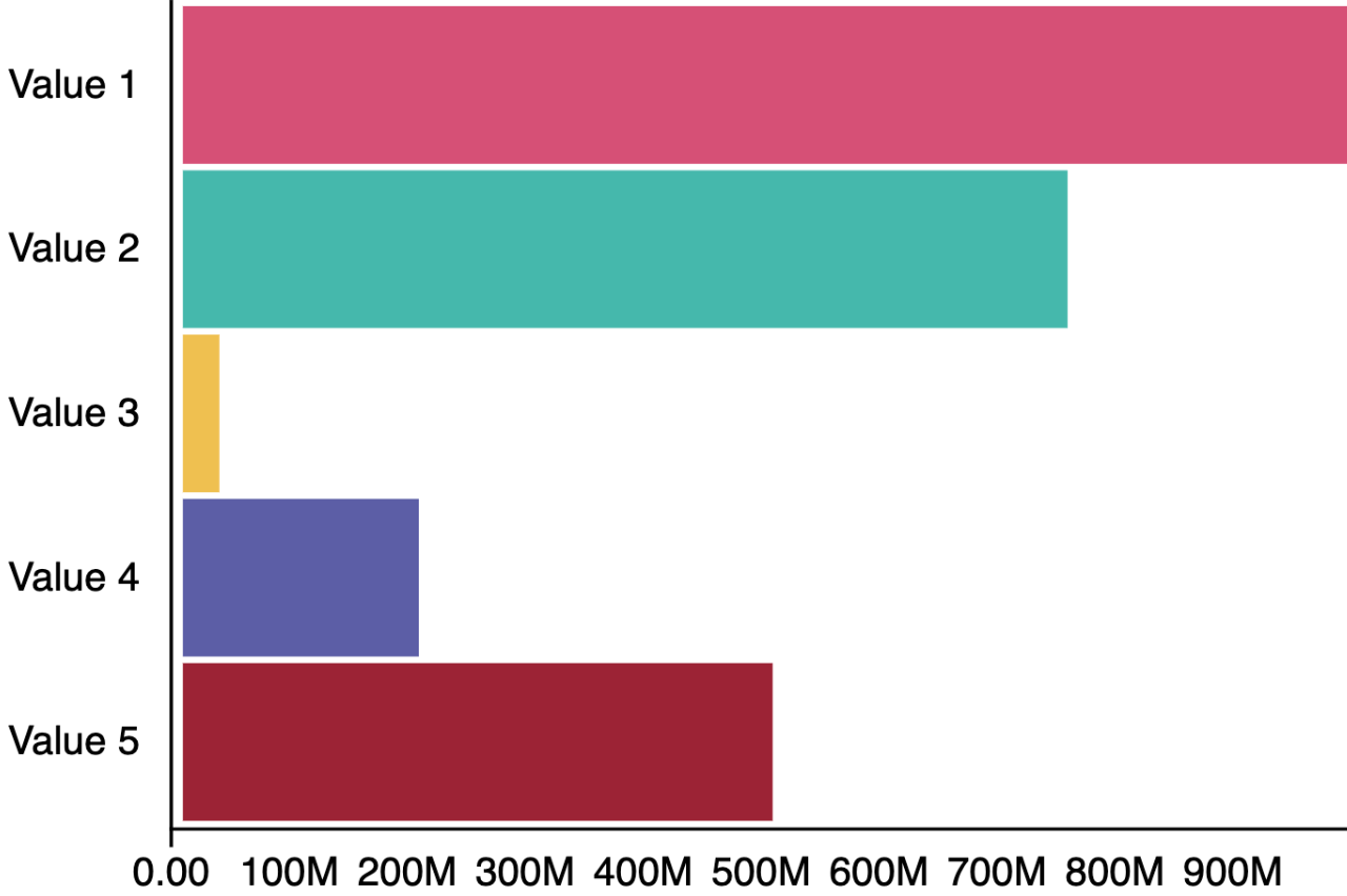
Creating a D3 bar chart begins as many others do. Chart JS, NVD3, D3, or even High Charts I believe, begin with either a canvas tag or an SVG element. That’s exactly what’s happening here. The SVG element is then wrapped in D3’s selector. Upon which, a whole host of methods make themselves available.
Table of Contents
Markup and Styling
Nothing over the top with the CSS. Pretty generic stuff. At the bottom though, notice the SVG tag wrapped in the graph-wrapper. That’s what we’re targeting. The SVG is the entire graph.
If you’re unfamiliar with D3, it’s a data visualization library. One that’s quite complex in nature. There’s even a project called NVD3 written over D3 to simplify the features. My opinion is, if you’re gonna learn NVD3, you may as well learn the underlying library itself. I’ve found it to be easier to use in some versions of Angular than others.
And once you get the hang of it, a pleasure to work with outside of frameworks. Which is unfortunately not too frequently. The complexity however gives devs fine grain control over literally everything imaginable. So learning it definitely has it’s advantages. Namely in the era of data visualization UIs we’re currently in.
#graph-wrapper {
  min-height: 300px;
  max-width: 750px;
  margin: 0 auto;
}

text { font-size: 1.2em; }
line { display: none;    }

[text-anchor="end"] .domain    { d: path("M 0 0.5 H 0.5 V 250.5 H 0"); }
[text-anchor="middle"] .domain { d: path("M 0.5 6 V 0.5 H 531.5 V 0"); }
</style>

<div id="graph-wrapper">
    <svg></svg>
</div>
D3 Bar Chart Script
After retrieving the element with the select method, we can draw shapes with append(). Notice .append used multiple times in this d3 bar chart. Append then modifies the element by chaining methods. Similar to archaic jQuery. What’s more, is we manipulate the DOM similar to many other libraries. Here however, animation occurs between values.
Harnessing D3’s real power however comes in when we introduce data. Done so either by an array or an external file. D3 will draw a shape for every point in the data set. Similar to RxJSs’ observables’ three methods of next, error, and complete… D3 has enter, update, and exit. Enter occurs on shape initialization. The update method occurs when there’s changes to the data set, giving devs the ability to react to changes. To no surprise, D3 also provides methods to listen for events, such as mouseover on tool tips for instance.
var parentDiv = document.getElementById('graph-wrapper'),
    svg = d3.select('svg'),
    svgWidth = parentDiv.offsetWidth,
    svgHeight = parentDiv.offsetHeight,
    margin = { top: 20, right: 30, bottom: 30, left: 60 },
    innerWidth = svgWidth - margin.left - margin.right,
    innerHeight = svgHeight - margin.top - margin.bottom,
    colors = ['#D65076', '#45B8AC', '#EFC050', '#5B5EA6', '#9B2335'],
    aspect = svgWidth / svgHeight;

function renderData(data) {
  var xScale = d3
      .scaleLinear()
      .domain([0, d3.max(data, (d) => d.amount)])
      .range([0, innerWidth]),
    yScale = d3
      .scaleBand()
      .domain(data.map((d) => d.item))
      .range([0, innerHeight])
      .padding(0.04);

  var g = svg
    .append('g');

  var formattedVal = (number) => d3.format('.3s')(number).replace('G', 'B');

  var yAxis = d3.axisLeft(yScale);
  var xAxis = d3.axisBottom(xScale).tickFormat(formattedVal);
  yAxis(g.append('g'));
  xAxis(g.append('g').attr('transform', 'translate(0, ' + innerHeight + ')'));

  g.selectAll('rect')
    .data(data)
    .enter()
    .append('rect')
    .attr('transform', 'translate(4, 0)')
    .attr('y', (d) => yScale(d.item))
    .attr('fill', (d, i) => {
      return colors[i];
    })
    .attr('width', (d) => xScale(d.amount))
    .attr('height', yScale.bandwidth()); // computed width of a single bar
}

function resizeGraph() {
  var targetWidth = parentDiv.clientWidth;
  svg.attr('width', targetWidth);
  svg.attr('height', Math.round(targetWidth / aspect));
}

svg
  .attr('width', svgWidth)
  .attr('height', svgHeight)
  .attr('viewBox', '0 0 ' + svgWidth + ' ' + svgHeight)
  .attr('perserveAspectRatio', 'xMinYMid')
  .call(resizeGraph);

d3.json('d3-bar-chart.json').then(function (chartData) {
  renderData(chartData);
});

window.addEventListener('resize', resizeGraph);
I think I seriously found D3 more confusing (initially) than Angular. I was new to data visualization libraries and techniques. Where we work and what we build no doubt defines us as developers. Developing data driven visualizations has no doubt made me a far better UI developer. After the uphill battle, I found the lib to be powerful, malleable, and quite unique. See a working version here. Regardless of where you’re at in your career, take some time and build a D3 bar chart.
Leave a Reply