
Last Updated on May 1, 2025 by Eric Feldberg
Creating a ChartJS line chart is relatively easy. What’s not easy, is creating a chartjs line chart that matches the mock. I’ve never seen a design that matches something that’s nearly ready built. Charts from libraries such as D3, NVD3, High Charts, and the like are powerful tools for a wide variety of needs.
None of them however are easy or even straightforward to customize. Additionally, adding features can be quite challenging. So, if your client provides you with a data visualization design, expect it to be a tedious endeavor.
This sample uses TypeScript. Not a tremendous amount, but a little. If necessary, brush up on your TypeScript skills with this rudimentary date picker. This project also uses JSON.
Run through this post to get more experience with importing and working with JSON data.
Otherwise, this project is ideal for general frontend development.
Without further ado, let’s get build our Chartjs line chart!
Table of Contents
Setting Up the ChartJS Line Chart
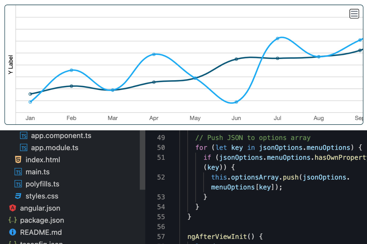
This chartjs line chart is totally customized. In the demo above…
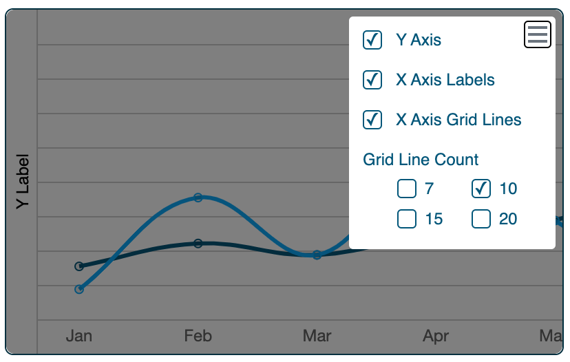
- toggle the x axis
- toggle the y axis
- toggle the grid lines
- change the amount of grid lines for better accuracy
- do it all with an elegant menu of said options
- powered by a JSON feed indicative of one or more APIs
Start with the data. This is what both lines expect. Followed by the data in the options menu. I initially thought using JSON for everything was time consuming and complex. Now it’s my preference. Regardless of the project, I make everything fully dynamic.
** Line Data
{
  "chartData": [
    {
      "line": [10, 50, 25, 70, 40, 10, 90, 67, 88, 112, 115, 120]
    },
    {
      "line": [20, 30, 25, 35, 40, 64, 65, 67, 75, 100, 100, 100]
    }
  ]
}

** Options Menu Data
{
    "menuOptions": [
        {
            "item": "Y Axis",
            "checkMark": true
        },
        {
            "item": "X Axis Labels",
            "checkMark": true
        },
        {
            "item": "X Axis Grid Lines",
            "checkMark": true
        },{
            "lineOptions": [
                {
                    "value": 7,
                    "percent": 14.28
                },
                {
                    "value": 10,
                    "percent": 10
                },
                {
                    "value": 15,
                    "percent": 6.67
                },
                {
                    "value": 20,
                    "percent": 5
                }
            ]
        }
    ]
}
These charts are created via an SVG tag or with a canvas tag. Having knowledge of either or both is very helpful. Neither tag is tremendously common in my experience, but absolutely amazing things can be created with them. If you have the bandwidth, I recommend learning them.
Though not needed, I’m using Angular here to assist with basic features. This is not required, but it may be more common to find data visualizations inside of an app built with a UI framework.
In the below code:
- chart is used to reference the chart
- chartDataArray is used to hold the data
- optionsArray holds the menu data
- optionsPanel is a boolean for whether or not the menu is open
- xGridVisible is for whether or not the x axis grid is visible
- xAxisVisible is whether or not the x axis labels are visible
- Same with the yLabelVisible variable.
- months array holds the months shown on the x axis
  chart: any;
  chartDataArray: any = []; // Chart Data
  optionsArray: any = []; // Menu Options
  optionsPanel: boolean; // Menu Status
  xGridVisible: boolean = true; // X Axis Lines
  xAxisVisible: boolean = true;
  yLabelVisible: boolean = true; // Y Axis Label
  selectedCheckbox: any; // InnerHTML of Selected Checkbox in Legend
  months: any = [
    'Jan',
    'Feb',
    'Mar',
    'Apr',
    'May',
    'Jun',
    'Jul',
    'Aug',
    'Sep',
    'Oct',
    'Nov',
    'Dec',
  ];
Getting the variables set up is a sign we have a plan. We know what values we need to work with. This of course is decided upon during development vs in advance. So don’t think it’s normal to know all the variables before writing the functions. It’s simply an easier way to explain the code.
Importing JSON to an Array
Chartjs makes it fairly easy to get up and running. Allow me to preface this however by saying I built this a while ago. In turn, it uses a version that may not be compatible with your setup. So, check the version here.
I’m gonna throw in two more variables shown below. In common UI frameworks, DOM elements appear and disappear. So the extra syntax is Angular’s way of keeping track of DOM elements that may not even be in the DOM. If you’re using React, you probably know how to “getElementBy…” the React way. Otherwise, you could simply use getElementById with vanilla JavaScript or TypeScript. That’s what the @ViewChild business is. They’re element references.
Below that is a life cycle hook. Life cycle hooks allow us to do things at various times during the loading process. Angular has life cycle hooks. React has life cycle hooks. Vue has life cycle hooks. Even custom web element have hooks. I’ll let you choose your hook. Here, we’re using OnInit.
In this hook, we loop over the data object with a for in loop. The data is imported. If you need a vanilla JavaScript solution, here’s one. It’s located at “Table in HTML Script” section. Succinctly, we take the JSON and pipe it into an array so it’s easier to work with. We do the same thing with the options menu data.
  import * as data from './data.json'; // Chart Data

  @ViewChild('yAxis', { static: false }) yAxis: ElementRef;
  @ViewChild('xGrid', { static: false }) xGrid: ElementRef;

  ngOnInit() {
    // Push JSON to array
    for (let key in data.chartData) {
      if (data.chartData.hasOwnProperty(key)) {
        this.chartDataArray.push(data.chartData[key]);
      }
    }

    // Push JSON to options array
    for (let key in jsonOptions.menuOptions) {
      if (jsonOptions.menuOptions.hasOwnProperty(key)) {
        this.optionsArray.push(jsonOptions.menuOptions[key]);
      }
    }
  }
Setting up the Lines and Grid
Each line in our Chartjs line chart is powered by our JSON data. Which is now encapsulated in an array. I’m using another life cycle hook that fires once the page has rendered. This is to obtain the element that houses the chart. Again, use life cycle hooks appropriate to your app.
This data variable contains everything needed for the two lines to look just the way we want. It’s an object with an array so we can have as many lines as we want.
let data: any,
      options: any,
      ctx: any = document.getElementById('lineChart') as HTMLElement;

    data = {
      datasets: [
        {
          label: 'Product A',
          backgroundColor: '',
          borderColor: '#02a9f7',
          data: this.chartDataArray[0].line,
          fill: false,
        },
        {
          label: 'Product B',
          fill: false,
          backgroundColor: '',
          borderColor: '#02577a',
          data: this.chartDataArray[1].line,
        },
      ],
      fill: false, // Change this to true, add rgba(...) in datasets background color
    };
data.labels = this.months;
The last line above sets the labels in the data object to our months array. There’s more configurations in the data object, but I’ll let you explore those on your own. The most important thing is below. In our chart variable, we set the chart object and use the data we created previously as the charts data value.
This is a cleaner method. It’s more readable and maintainable.
    this.chart = new Chart(ctx, {
      type: 'line',
      data: data,
      options: options,
    });

    // 10 line spaced 10% apart. See options.json
    this.generateXgridLines(10, 10);
Lastly, we create the lines for the x axis.
  // Generate X Axis Grid
  // Clear div
  // Inject divs with dynamic styling
  generateXgridLines(lineCount: number, percentage: number) {
    this.xGrid.nativeElement.innerHTML = '';
    this.selectedCheckbox = lineCount;
    for (var i = 1; i < lineCount; i++) {
      this.xGrid.nativeElement.innerHTML +=
        "<div style='top:" +
        Math.round(percentage * i) +
        "%' class='xLines'></div>";
    }
  }
When we change the line count in the options menu, we run the below function. There’s a little more code required for all the options, but this is the crux of it.
  // Change x axis line count
  // Select Checkbox on Line Number
  changeLineCount(xLines: any, e: any) {
    this.generateXgridLines(xLines.value, xLines.percent);
    this.selectedCheckbox = e.target.parentElement.querySelector('p').innerHTML;
  }
Rendering the Chart
Now that we have the functionality written, we need the markup.
I’ll explain the concept here since your project is most likely different. You can then replicate how it’s done on your end. #xGrid is the elemental reference since we’re toggling the display to none. So, even though it’s not officially removed from the DOM, it’s still inaccessible from being obtained via document.querySelector. [ngClass] is a dynamic class. When xGridVisible is false, the displayNone class is applied.
The canvas tag is obtained in the second life cycle hook, above. And this canvas tag reference is passed into the new Chart class.
#yAxis was obtained earlier in the third block of code. The remainder of the code is largely focused around the menu. Which is tedious. If you’ve gotten this far, congratulations. This stuff is not easy.
<div class="graph">
  <div
     #xGrid
     class="xGrid"
     [ngClass]="{ displayNone: !xGridVisible }"
  ></div>
  <canvas id="lineChart"></canvas>
  <div #yAxis class="yAxis"></div>
</div>
It’s more of a creative process than a technical one. One in which I enjoy to be honest. It’s an art. And this charting library makes it easier to bypass the hard stuff. Yes, this is written in version 2, but I think it’s the logic behind the project vs the actual code. One could do the same thing with HTML and vanilla JS. Or Vue. Or React. From one developer to the next. Hope you found this thought provoking. Please see a working version of Chartjs Line Chart on Stackblitz here.
1 thought on “Custom ChartJS Line Chart Solution”