

Last Updated on May 2, 2025 by Eric Feldberg
This Angular template website began with the hopes of it being for this domain. But as we all know, development plans change.
There’s an onslaught of wonderful features loaded throughout. Features include but are not limited to:
- All content is derived from a Node.js API w/ one default route.
- The API sends a JSON payload w/ 10 items per request.
- Custom back button that works w/ query parameters.
- Back button directive enabling placement of thereof on any page.
- Notification when user clicks the browser back button.
- Pagination, w/ query parameters (requests the next 10 from the API).
- All payload data is cached.
- When the current page is selected, it’s checked against the cache.
- API calls are only made if content doesn’t exist.
- Page loader w/ CSS3 animation.
- Modular categories. Meaning each top tier category has it’s own module and child routing.
- Inbuilt shared module.
- Each page has randomly generated categorically related content (thumbnails). This is a blog inspired feature where users are presented with additional reading options.
- Six social media icons that appear either in the sidebar or after the content.
- Pages have two different layout options that are easily configurable.
- A media query service making screen sizes a breeze (ngIf=”screenSize > 728″).
- Local storage interface.
- Categories interface.
- Local storage service.
- Sidebar component
- Color variables that can be imported anywhere.
- Reset.css.
- All category pages (pages w/ ten items and pagination) share the same style.
- Method to easily access the window object.
- A proxy that runs on an alternate port. This allows the API and UI to be run in tandem.
- Config file w/ category names and a config service to broadcast it via a Behavior Subject.
- All subscriptions are prepended w/ RxJS methods that unsubscribe.
- Custom mobile animated fly out menu w/ burger icon.
Table of Contents
File Structure
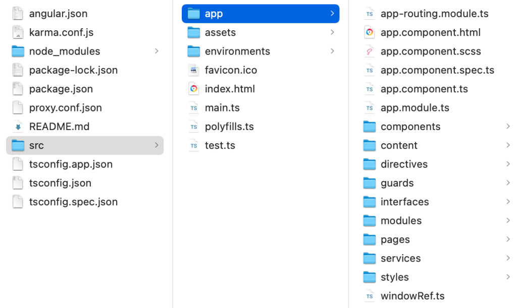
Before talking specifics, let’s check out the project structure. This is a screenshot of the entire project, excluding the Node API.
- app.routing.module.ts routes to all the top tier modules.
- app.component.html contains the navigation, router-outlet, loader, and footer.
- app.component.ts is basically one big config file allowing us to use data streams throughout.
- The components directory contains components we use. Things such as the header, footer, loader, the right column, etc.
- Directives contains one item—the back button.
- Guards holds the loader guard, preventing access until certain things are loaded.
- Interfaces is for payloads. There’s lots of data being moved around and updated. These files are blueprints of those data streams.
- Modules are the top tier containers mentioned above (about, leadership, library, security, a shared module, and one for standards.
- Pages contains the same group which is basically a wrapper for all page content in those categories.
- Services are utilities. This is the meat and potatoes of the app.
- Styles directory contain the page style, reset, global classes, and modular styling.
The environments folder contains two files. environment.ts contains code for a proxy:
export const environment = {
  production: false,
  apiUrl: 'localhost:8080'
};
While environment.prod.ts is to direct the API:
export const environment = {
  production: true,
  apiUrl: 'https://frontenddevelopment.tech/app/'
};
index.html contains a rudimentary HTML page containing <my-app></my-app> which holds the entire application.
<!DOCTYPE html>
<html lang="en">
  <head>
    <meta charset="utf-8" />
    <title>Frontenddevelopment.tech</title>
    <!-- <base href="/angular-spa/" /> -->
    <base href="/" />
    <meta name="viewport" content="width=device-width, initial-scale=1" />
    <meta name="author" content="Eric Scott" />
    <meta name="robots" content="index, follow" />
    <meta charset="UTF-8" />
    <link rel="icon" type="image/x-icon" href="favicon.ico" />
  </head>
  <body>
    <my-app></my-app>
  </body>
</html>
Responsive Angular Template Website
There’s numerous breakpoints in place throughout the site. But these are the big ones housed in styles.scss. A feat which would undoubtedly be a nightmare w/ Bootstrap. I often build things like this to gain complete control over every detail. Style frameworks are good in my opinion for cookie cutter projects. And one in which you don’t mind if it looks like many other apps. Though this is an Angular template website, it’s the furthest things from conventional.
- @media screen and (max-width: 1300px)
- @media (min-width: 1200px) and (max-height: 700px)
- @media only screen and (max-width: 1375px)
- @media screen and (max-width: 1300px), screen and (max-height: 760px)
- @media screen and (max-width: 1200px)
- @media screen and (max-width: 992px)
- @media screen and (max-width: 768px)
- @media only screen and (max-width: 605px)
- @media screen and (max-width: 500px)
- @media screen and (max-width: 450px)
@media screen and (max-width: 1300px), screen and (max-height: 760px) is responsible for rearranging the UI when the height changes or the Dev Tools are opened.
There’s also of course SCSS files for most components. Styles are certainly shared and optimized wherever possible. The category styles for instance all share one sheet. Style color variables are also shared in _page-style.scss.
Lots of developers opt in to Tailwind for utility classes, Material for components, or Bootstrap for responsiveness. None of which I advocate. Tailwind just makes things convoluted in my opinion. Material is massively tedious to configure and maintain. And Bootstrap is intended for devs who don’t know CSS in my opinion.
I’m all for extraneous libraries and packages, but I’ll handle the CSS or SCSS myself.
Angular Template Website API
The Node backend is not complex whatsoever. There’s a simple index file requiring Express and Helmet. It listens on a default port and uses routing. In the route, the function deciphers what category is being requested and filters the array of projects. In turn, only the chosen category is returned.
const port = process.env.PORT || 8080;

const express = require("express");
const app = express();
const helmet = require("helmet");

app.use(helmet());

app.use("/api/compliance-library", require("./routes/compliance-library"));

app.listen(port, (err) => {
  if (err) {
    console.log(err);
  } else {
    console.log(`listening on port ${port}`);
  }
});

module.exports = app;
In the UI, the amount is set to an increment of ten which increases every time new pagination is requested. The Express route receives this increment and in turn, returns the next group of ten. This route also handles category totals.
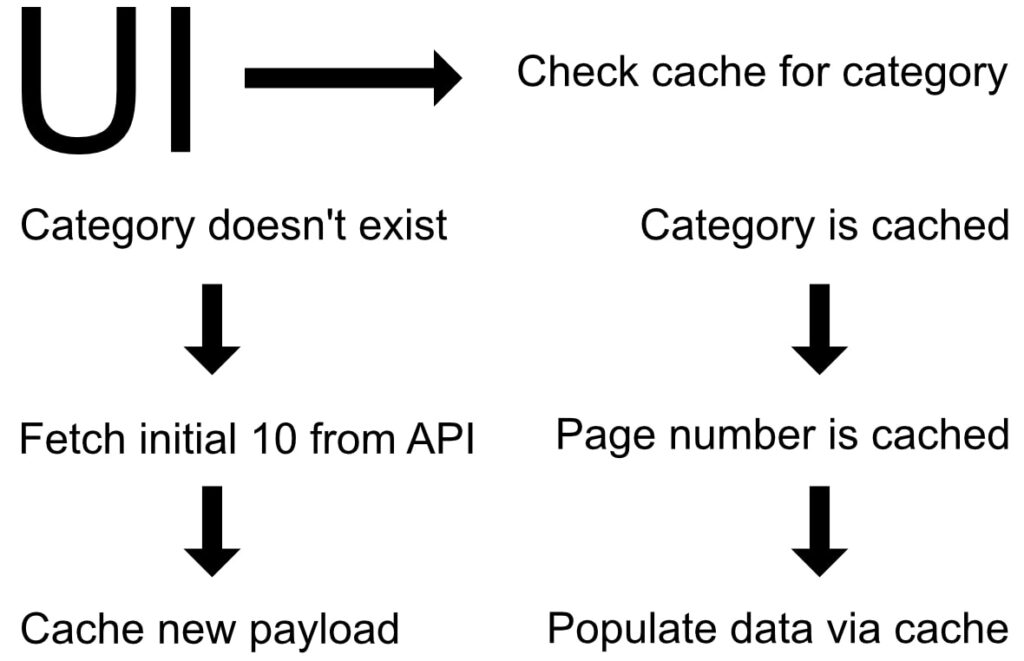
Each time a request to the backend is made, the results are cached. What’s more, is that before the actual call is made, the cache is checked for the category AND for the selected group. For example, page one is selected, and there’s no cache — a request is made. If the user goes from page one to page three, it’s the same process. When the user returns to page one, a backend call is not made because the results are cached. A call is then made when page two is requested.
This is all made possible by setting up a Node API on the server. Node modules are installed on the server vs being uploaded directly. Additionally there’s several server configurations made followed by rigorous testing.
Running this locally requires a proxy.
// npm run start
"start": "ng serve --proxy-config proxy.conf.json",

// proxy.conf.json
"/api": {
   "target": "http://localhost:8080",
   "secure": false
}

// In an alternate terminal fire up the Node API
listening on port 8080
If however you’re not interested in using the API and would like to serve JSON locally, this is possible. This is the project-list service. It contains lots of the methods that enable the entire site to operate. One of the main features is, checking to see if the page content is cached. As illustrated in the graphic above.
The function that kick starts this entire process is getAllProjects. To bypass the API and load JSON via the assets directory, replace all instances of getAllProjects, with getLocalProjects.
Project List Service
Our Angular template website is largely powered by one service. Project-List service is responsible for an array of tasks. Including but not limited to:
- Loading other services
- Deciphering if page content is cached or if it needs to be fetched
- Caching said resources
- Setting pagination count in the URL
- Updating the local storage service
- Route navigation
- Optionally loading JSON via the assets directory
- Using RxJS to manipulate data and update other resources
- Building the cached object
- Destroying data streams fed into subscribers
There’s a lot happening here. Minus the optional JSON function it’d only be about 180 lines. It’s jam packed with robust, succinct TypeScript that’s been refined dozens of times.
Writing services like this has trained me to modularize virtually everything else I do. I was recently on a team with an under qualified team lead and a developer that didn’t know a lick of Angular or TypeScript.
Both of them would rather duplicate code and merge massive, unsustainable files than organizing code into bite size pieces. Not in my Angular template website—lol.
Do you adhere to DRY principles? Do you use services throughout your apps?
Angular template website, React, Vue, whatever…this is how I develop applications.
One example of how the Project List service is being used, is within page content.
Let’s take this page for instance. In this page, we pass the data to the service and update an object. This could in fact be simplified, but it’s certainly one way without a more in depth API.
This object is then passed to the related-components component. Our Angular template website then takes in account all the category content and displays random pages in the sidebar. No different than what blogs have. “Recommended reading”, “related content”, etc. This is where the thumbs come from.

export class DynamicSidebarComponent {
  imgUrl = '../../../assets/images/building_trust.jpg';
  pageDataObject: PageDataObject = {
    title: 'Building Trust',
    publishedOn: 'Oct 1, 2022',
    updatedOn: 'Jan 10, 2023',
    repoTitle: 'angular-dynamic-sidebar',
    repoLink: 'https://github.com/eastcoastdeveloper/Angular-Dynamic-Sidebar',
    category: '',
    views: 5856,
    forks: 149,
    threeColumnLayout: true,
    cornerStone: false
  };

  constructor(
    private _globalFeatures: GlobalFeaturesService,
    private _projectListService: ProjectListService
  ) {
    this._projectListService.changePageDataObject(this.pageDataObject);
  }

  navigateToPage(url: string) {
    this._globalFeatures.externalLink(url);
  }
}
Local Storage Service
The local storage service builds and updates cache in local storage. This is the object:
  storage: LocalStorageInterface = {
    all: {},
    leadership: {},
    standards: {},
    security: {},
    totals: {
      all: undefined,
      leadership: undefined,
      standards: undefined,
      security: undefined
    }
  };
Data is pushed into the appropriate keys. In the project-list service we search this very object right here. isThereCache runs everything we need.
  isThereCache(type: string, pageNum: number, limit: number) {
    this.categoryType$.next(type);
    const storage = this._local.getData('frontenddev');
    this.projectArray = [];

    this.currentRoute = this._location.path();
    // There IS Cache
    if (storage != '') {
      const parsed = JSON.parse(storage);
      this._local.storage = parsed;

      // If Requested Page is Cached w/ a Value
      // Set Pagination Count
      if (this._local.storage[type].hasOwnProperty(pageNum)) {
        this.totalPages = this._local.storage.totals[type]!;
        this.totalPages = (Math.ceil(this.totalPages / 10) * 10) / 10;
        this.totalItems$.next(this.totalPages);
        this.projectArray = this._local.storage[type][pageNum];
        this.allProjects$.next(this.projectArray);
        this.navigateToRoute(pageNum);
      }

      // Requested Page Called First Time
      else {
        new Promise((resolve) => {
          this.getAllProjects(type, pageNum, limit);
          // this.getAllProjects(type, pageNum, limit);
          resolve(this.saveNewlyCachedData(type, pageNum));
        });
        this.navigateToRoute(pageNum);
      }
    }

    // Nothing's Cached
    else {
      this.getAllProjects(type, pageNum, limit);
      // this.getLocalProjects(type, pageNum, limit);
    }
  }
Back in the local storage service we have the usual storage methods.
- saveData
- getData
- removeData
- clearData
- encrypt
- decrypt
saveData is called from project-list in two places. Once to save the data to a value in local storage called ‘frontenddev’. It’s used again to update the page totals—the last key in the storage object. Everything here is highly organized. Allowing us to tap into whatever resources we need anywhere in the application.
In app.component.ts, among the main entry points of the entire app, we reference another method from local storage: getData. As the app fires up, we set those values mentioned earlier. ngAfterContentChecked is an Angular hook used in the loading process.
ngAfterContentChecked(): void {
const storage = this._local.getData('frontenddev');
if (storage != '') {
const parsed = JSON.parse(storage);
this._local.storage = parsed;
this.totalAll = parsed.totals.all;
this.totalProjects = parsed.totals.leadership;
this.totalComponennts = parsed.totals.standards;
this.totalDevelopment = parsed.totals.security;
}
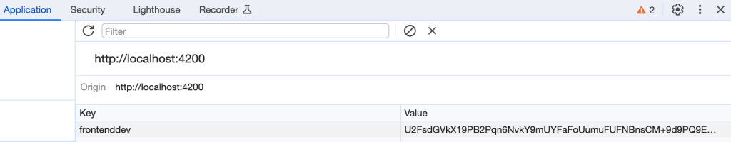
}We use encrypt in the saveData method and decrypt in the getData method. If we open the DevTools, our cached data looks like this:
Other Features
Let’s run through another feature in our Angular template website—the back button. The back button is controlled via the navigation service and used in three pages. project-list.component.html is a wrapper for every page except library and about. Consequently, every page in the app has access to the back button.
If you really wanted to, you could strip out this entire feature and use it in another JavaScript or TypeScript app. How cool is that?
This is why I lost total respect for my former team lead and my bozo coworker who argued with me over modularizing stuff. If developers can use components in multiple applications, AND apps with different frameworks, it’s a badass feature!
The constructor is larger than I’d like, but it’s flawless and ties in with the API. This is the back button component, and this is the navigation service.
Once the constructor is loaded, this backButton function is called on every click:
back() {
    var arr = this.history;
    if (arr.length > 1) {
      arr.pop();
      if (arr[arr.length - 1].includes('?page=')) {
        const urlEndingPosition = arr[arr.length - 1].indexOf('?');
        const url = arr[arr.length - 1].slice(0, urlEndingPosition);
        const queryParamIndex = arr[arr.length - 1].indexOf('=');
        const queryParamValue = arr[arr.length - 1].slice(queryParamIndex + 1);
        this.router.navigate([url], {
          queryParams: {
            page: queryParamValue
          }
        });
      } else {
        this.router.navigateByUrl(arr[arr.length - 1]);
      }
      arr = this.history;
    }
  }
Feel free to pluck this feature and use it for your own devices. There’s a catch—ya gotta comment and let me know how it worked out! Anywho, I really hope this Angular template website was both educational and perhaps useful!
Conclusion
Embarking on this endeavor has been a challenging development process. With obstacles at every turn, it’s possible that building this has been more trying than most if not all other projects. Let’s be real. How often do we as devs get the opportunity to build a massive application entirely on our own? To see more projects like this, view them here.
Regardless, I’m pleased it’s in a good place. One in which I can seamlessly add new features. Please see my other websites, this dynamic UI, or a fascinating directory creation tool I created. I hope you’ve enjoyed my explanation on this Angular template website.
Your ability to present detailed information in a clear and engaging manner is impressive. This article demonstrates a deep understanding of the topic and offers valuable perspectives. Thank you for contributing such high-quality content to the discussion.
Thank you! I’m thrilled you found this useful. Very much appreciated.